Advertise at Beckman
Put your message on our digital signs
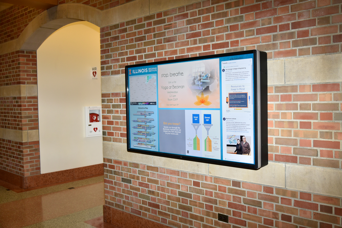
The Beckman Institute has a number of digital signs that advertise events held at the institute, the University of Illinois, and throughout the community.

Events advertised on digital signs at the Beckman Institute should have a broad appeal to faculty, staff, and students.
Digital ads appear on a rotating basis throughout the day.
The Beckman Institute has the right to refuse a digital ad. We request that ads follow these guidelines:
- Submit your ad using our digital ad upload form (below) at least one week before the first date you would like it to appear.
- Please include the start and end dates for your advertisement.
- Required size: 1920 pixels wide x 1080 pixels tall at 96 dpi
- Format: High-quality JPEG files with a .jpg filename extension
- For a quick digital sign design solution, use our digital sign template (PPT file).
Tips to take into consideration when designing digital ads
Text size
Most digital signs are viewed from a distance of 7-10 feet. Sans-serif typefaces are the easiest to read. This can be a font such as Arial, Helvetica, or Verdana. A 20-point font can be seen from 7
feet away, whereas a 100-point font can be seen from 26 feet away. We recommend at least 41-point at 96 dpi for our digital signs.
Color, contrast, and legibility
Your message can get lost if the viewer can’t easily separate the elements of your design. Contrast is the primary factor for legibility. Poor contrast reduces legibility; good contrast improves
it. Always make sure there’s plenty of contrast between your background and foreground colors, especially for text. We want to use the same contrast ratio that is required by WCAG (Web Content Accessibility Guidelines)
for the web (7.1). You can review the contrast at the Contrast Checker.
The 3 x 5 rule
Words on the screen are there to communicate a clear, concise message. Don’t clutter your designs with too much text. Keep the type size large for readability at a distance, and present
only the most important information. Try not to use more than three lines of text of five words each OR five lines of text of three words each.
Focus techniques
Use focus techniques to guide the eye to critical information first and create a visual hierarchy in your design. Headlines, graphics, bright colors, and high contrast items will pull the eye to them. Size also
tells the audience the priority of design elements, as does their arrangement, angles, and open space.
Less is more
Make your ad read like a billboard: Quick, memorable, and to the point. You can add a URL for someone seeking more information.
Upload your digital ad artwork
Need help?
If you any questions about advertising on our digital signs, contact the Communcations Office at Beckman.
